By Sebastian Chittadini
Of Chittadini
1969 was a turning point in Jerry West’s life and in the NBA. That year, in the series in which the Celtics defeated the Lakers, the league introduced the Finals MVP award and he won it despite his team’s defeat. To this day, he remains the only player from the losing team to do so.
Walter Kennedy, commissioner of an NBA looking to strengthen itself and prevail in its fight against the rival ABA, contacted designer Alan Siegel. Specifically, the request was to create a logo for a league looking for a strong symbolic presence among fans.
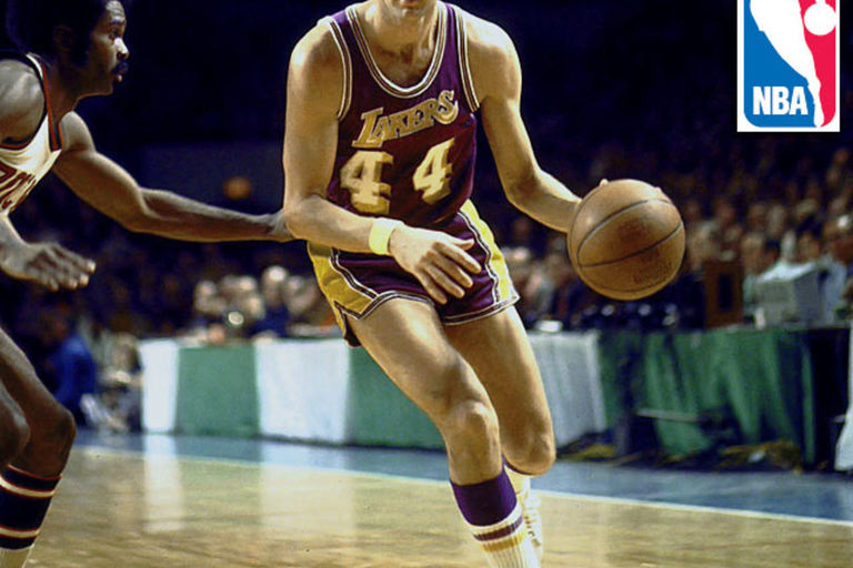
Siegel began to think and analyze photos of different games and players, until he came across one of the Lakers star in the magazine Sports Illustrated. That photo captured the essence of the game, it was dynamic, perfect. Something about the vertical arrangement of West’s silhouette photographed by Wen Roberts told him that this was THE image to start working on. Inspired by the Major League Baseball logo, which he had designed himself, he created a blue and red image based on the silhouette of West hitting the ball. “The Logo” was born; its inspiration was 31 years old at the time.
Commissioner Kennedy fell in love with the prototype at first sight, who did not know that the icon had been modeled after Jerry West. Nor was the player asked anything about what he thought about the use of his figure. He would begin to be nicknamed “The Logo” and he would hate him with everything he was. The next stage would be shame and a vain request for the league to change that image. By 1971, Siegel had already delivered the final design to the NBA and the logo would appear for the first time on referees’ jerseys. During the Finals of the 1971-72 season, he would coexist in the graphics of the ABC television broadcast with the number 44 of the Lakers who would win the championship. The flesh and blood logo averaged 25.6 points and 9.7 assists in that series, he still had two more seasons left as a player.
Siegel’s design would gradually begin to appear on NBA stadium signage, All-Star game jerseys, and finally on team jerseys at official games in the 1986-87 season. As the league grew in the 1980s with the rivalry between Magic Johnson’s Lakers and Larry Bird’s Celtics, and went global in the 1990s with Michael Jordan as its ultimate reference, the Jerry West silhouette logo would become one of the most recognizable and transcendent cultural symbols in the world of sport.
The signs team
By linking the NBA logo to semiotics, the study of signs, we could put together a hypothetical starting five made up of prominent theorists Roland Barthes, Jean Baudrillard, Charles Sanders Peirce, Umberto Eco and Ferdinand de Saussure.
Barthes would be the team’s point guard, analyzing how Jerry West’s red, blue, and white silhouette became a sign that conveys the essence of the world’s best basketball league. Baudrillard, known for his critical approach to culture and media, would be the shooting guard who would skillfully combine the physical representation of the logo with its character as a symbol of globalization and the entertainment and marketing industries. Peirce would be a complete and versatile forward who would focus on how the NBA logo is at once an icon, a symbol, and an index of presence and popularity. Eco would be a power forward adaptable to different contexts, examining how the league’s institutional image is inserted into popular culture and interpreted everywhere in the world. Last but not least, Saussure would serve as the pivot, a reference for the team when it comes to understanding how the logo combines the visual signifier of West’s image with a cultural meaning for basketball.
In this team of signs, a real “Dream Team” of semiotics, each author would contribute their theoretical perspectives, working together to interpret and analyze this cultural phenomenon from different angles.
To be or not to (want to) be READ FULL STORY HERE>>>CLICK HERE TO CONTINUE READING>>>
It was the fate of Jerry West, a basketball legend, to be tied to an iconic image for which he never received a single dollar in royalties. He died – this June 12, 2024 – knowing that the NBA would never recognize that the man with the logo was him, even if everyone knew it and he hated him. During the 55 years that he lived being nicknamed “The Logo”, it felt like a burden, the constant reminder that he coexisted with an identity that went beyond his own. His paradox lies in the symbolic immortality he achieved by inspiring the NBA logo, contrasted with the lack of tangible recognition of his enormous sporting contribution.
Over the years, his frustration with being and not wanting to be reached its limit. He even stated that he felt ashamed for being the logo and that he wanted the NBA to change it. Many people said there were valid reasons why West should not be the logo and he proposed eventual replacements. The logo itself suggested names that he thought were more appropriate than himself; like Kareem Abdul-Jabbar and his signature “sky hook,” the also iconic logo “Jumpman” of Michael Jordan or a flight of LeBron James. The league completely ignored him. There was no interest in going through a process of rebranding something that works perfectly. Nor was there any consideration given to changing the silhouette of the logo to that of Kobe Bryant, who died in a tragic plane crash in January 2020. The league understood that there were other ways to honor his memory without depicting him in the NBA logo.
Thus, the discussion about changing the logo came to an end. Designer Alan Siegel never hid his inspiration from the Jerry West silhouette, but in a 2017 interview he said that commissioner David Stern (who led the league from 1984 to 2014) was never going to recognize who the player in the logo was. . He even theorized that it was a way to prevent the former player from asking for royalties for the use of his image. Today, the classic image generates around $3 billion a year in official licensing and the NBA name symbolizes the ultimate in terms of excellence among sports organizations around the world. Regarding whether the league should have ever given something to photographer Wen Roberts or West himself, spokesman Tim Frank said that the authorities of the best basketball league on the planet had no record of what Siegel’s source of inspiration had been, ignoring the designer’s own statements.
Where do logos go when they die?
Like the brands they represent, logos can undergo changes or even go out of use over time, but they almost never “die” in the literal sense. When a brand decides to change its visual identity or retire a logo, there is usually a carefully planned transition process.
In some cases, old logos may continue to exist in archives and historical records as part of the brand’s legacy. They can also be reused in commemorative products or in marketing campaigns that appeal to nostalgia. In more metaphorical terms, the “death” of a logo can symbolize the end of one era or the beginning of another. It is seen as part of the evolution of brands in their quest to remain relevant.
Jerry West may have left this scene, but his silhouette as the iconic NBA logo will live on in popular culture. His story is a reminder that true greatness transcends labels, symbols and nicknames. And it is there that he will be remembered for his extraordinary athletic ability, his achievements, his leadership and his influence beyond the court. In that sense, he is much more than a logo. Although paradoxically that is what makes his impact lasting and eternal. To paraphrase the song: “Murguita del Sur”from the Argentine band Bersuit Vergarabat, that silhouette that is on all the t-shirts transforms him into a dead person who never stops being born in the collective imagination.
By Sebastian Chittadini
Of Chittadini
2024-06-28 13:50:00
#Jerry #West #Paradox
Related
